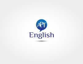
Design a Logo for a Language Tutoring Website

  • Estado: Closed
  • Premio: $85
  • Propuestas recibidas: 35
  • Ganador: aduetratti

Resumen del concurso

Design Brief – Apt English Logo

Apt English is a new* online business offering English language tuition and related services to both consumers and business clients. The target audience comprises learners for whom English is not their first language. The logo required will primarily be for use in the consumer market.
(*The business has been running for some time in a very organic way. We are now in the process of packaging it.)

The main offering is currently English language classes with native speakers. Products include English Conversation, Business English and Exam Preparation among others. Both private classes and group classes are available.

Additional online learning content will be added over time.

Secondary services that are available but will not (yet) be actively promoted include proofreading and writing – articles, promotional materials etc


Vision
Apt English aims to offer a high quality product to our users, including offering the option of a personally tailored or bespoke learning programme. We are committed to providing excellent teaching and excellent customer service.

We believe that students learn best when they are relaxed and feel comfortable with their teacher. We need to provide them with that welcoming, comfortable environment, while remaining focused and professional.


Name
Apt is not based on initials – it is a word meaning being suitable, appropriate or right for a particular situation. It has a second meaning of being clever, or having a natural skill or ability.

The first meaning reflects our vision of ensuring that our users are given the tools to communicate effectively in English in any particular situation.


Colour
Open to suggestions


Font
We would like a sans serif font. To ensure that the logo is grammatically correct, English must be written with a capital 'E'. We are open to use of upper or lower case for the other letters.

As visitors will mainly be non-native speakers, the font needs to be clear enough for them to read any letters easily.


Images
Any images used should be original


Feel
The logo needs to set the tone for the site, balancing the idea of aptness (see above) and professionalism with a welcoming, friendly and reassuring tone. It should not look or feel like a cartoon.

The ideal logo will probably be more timeless than 'modern', but you may surprise us. We do not want to have to re-design the logo again in 18 months because it has started to feel dated.


Requirements:
We currently need the following elements for the website:
· a logo that includes the name Apt English
· a small logo for use on exercises etc

The logo should be designed with future use on business cards and letterhead in mind, so it should look good both on screen and in print.


And finally...
There is probably far more information here than you want, but if there is anything that you would like to know, please feel free to come back to us.

Thank you and good luck!

Habilidades recomendadas

Comentarios del empleador

“We were delighted with the designs that aduetratti submitted for our logo. He was very responsive, professional and clearly put a great deal of thought into what we were looking for. He also included a bonus design, even though we would have been happy to pay for it. He immediately fixed one small point that we raised. We would have no hesitation recommending him to anyone looking for a real, professional and creative designer, who understands the concept of excellent customer service. He delivered far in excess of our expectations and will be our favoured designer for any future design work.”

Imagen del perfil MiaPeregrina, United Kingdom.

Tablero de aclaración pública

  • MiaPeregrina
    Organizador del concurso
    • 10 años atrás

    Thank you all very much for your varied logos. A number of your designs impressed us but we have now agreed on a winner. We wish you all well in future contests.

    • 10 años atrás
  • roystanleyc
    roystanleyc
    • 10 años atrás

    Pllease rate my #66 design . Thanks!

    • 10 años atrás
  • roystanleyc
    roystanleyc
    • 10 años atrás

    Pllease rate my #65 design . Thanks!

    • 10 años atrás
  • sumit0496
    sumit0496
    • 10 años atrás

    plz see #61

    • 10 años atrás
  • sumit0496
    sumit0496
    • 10 años atrás

    plz see #59, #60

    • 10 años atrás
  • MiaPeregrina
    Organizador del concurso
    • 10 años atrás

    Thank you all for you great new contributions. I have given you individual feedback on the latest entries.

    • 10 años atrás
  • aduetratti
    aduetratti
    • 10 años atrás

    hi,
    could you give me a feedback to #26 and #33 ?
    can i do something to make them better?
    thanks

    • 10 años atrás
    1. MiaPeregrina
      Organizador del concurso
      • 10 años atrás

      Hi aduetratti,

      Thank you for your design, especially the very clever(or apt!) #33 .
      Please check your PMB for a detailed response.

      • 10 años atrás
  • robertmorgan46
    robertmorgan46
    • 10 años atrás

    #33 and #26 are not sans serif fonts, okay to use serif ?

    • 10 años atrás
    1. MiaPeregrina
      Organizador del concurso
      • 10 años atrás

      Hi Robert, sorry for the delay in replying - I could not login for some reason.

      I can see why you asked this. The reason that we did not want serifs is that they can make reading for dyslexics. The general rule still applies but in the case of the font used in #33 and #26 , the serifs are not ubiquitous, and the font is easy to read. So a light smattering of serifs could be OK. Use your discretion! (At least two of the decision-makers loathe Times Roman, for example, so that should be avoided).

      Thank you for your interest and for checking.

      • 10 años atrás
  • MiaPeregrina
    Organizador del concurso
    • 10 años atrás

    Thank you to everyone who has entered the contest so far, and especially to those of you who have acted on feedback and submitted new or revised designs.

    We realise that it is difficult to capture our business in an image. While many of the designs are great, unfortunately they just do not all reflect the service we offer.

    Feedback:

    #15 - the featured E puts English at the heart of the business, which is good. Font should be sans serif
    #16 - this one feels very sombre and weighty, too corporate. Font should be sans serif and not terribly keen on the shadow

    #17 - very simple and clean; we particularly like the image that doubles as an A and a speech bubble producing the E, as it encapsulates the idea of communication
    #19 - we like the font but the image feels more like that of an airline or courier company
    #21 - we quite like this but prefer your #17
    #22 - like the colour and the font

    • 10 años atrás
    1. sumit0496
      sumit0496
      • 10 años atrás

      plz tell me any quary pmb

      • 10 años atrás
  • MiaPeregrina
    Organizador del concurso
    • 10 años atrás

    #18 - simple and clean; the tick reflects the correctness idea of apt

    #20 - nice font but again it just doesn't feel right for us

    #23 and #24 - first designs to try and address the online nature of the business; like the globe but the mortar board doesn't work for our model

    I hope that I haven't missed anyone out. Thanks again for all your efforts

    • 10 años atrás
  • MiaPeregrina
    Organizador del concurso
    • 10 años atrás

    #14 - nice use of colour. Different. Thanks

    • 10 años atrás
  • MiaPeregrina
    Organizador del concurso
    • 10 años atrás

    #13 - thank you for entering so many options. The colour scheme of this one seems a bit 'busy'; we preferred #9 and #10 from this point of view. However, the focus is still too much on books and writing. Sorry

    • 10 años atrás
  • MiaPeregrina
    Organizador del concurso
    • 10 años atrás

    #12 - amended version of #11 - thank you for fixing the name. However, as mentioned before, we don't really use books, so this doesn't reflect the nature of our business.

    • 10 años atrás
  • benyoucef0616
    benyoucef0616
    • 10 años atrás

    sooorrrryyyyyy !!!!

    • 10 años atrás
  • MiaPeregrina
    Organizador del concurso
    • 10 años atrás

    Perhaps it would be useful to re-state that this is an online business. Our clients are spread throughout the world and the majority are business people or others who need to develop style and fluency in English, often for work purposes, or to enter university in the UK or US. We generally only use books if a client specifically requests it, and that rarely happens. Most classes are based on mixed media, PowerPoint presentations and other pre-prepared handouts, as well as role plays and discussions. We aim to provide clients with practical skills, so we are not an academic institution. I hope this helps, but please get in contact if you have any questions. Thank you

    • 10 años atrás
  • MiaPeregrina
    Organizador del concurso
    • 10 años atrás

    #11 - rejected due to use of incorrect name; it's Apt English, apt English, APT English or APT ENGLISH

    • 10 años atrás
  • MiaPeregrina
    Organizador del concurso
    • 10 años atrás

    Thank you all so much for working for submitting your ideas. Here's a little more feedback.
    #6 - refinement of #5 - extra space in the circle feels much less constrained - thank you. Not sure about the font.

    #7 - like the idea of the student at the heart of it all but the colour scheme is very bright. Overall, the design seems more suited to a third-level college than to our business.

    #8 - unfortunately, there is just too much going on in this logo. The colour scheme is far to bright for us, causing the letters to look as though they are hopping around. It's also difficult to see any unity between the different elements.

    #9 - nice student-centred, balanced image. We like the font too. Unfortunately, it seems to project more of an academic image that we need.
    #10 - another very nice balanced image, but unfortunately, as with #9, it doesn't really suit our business but would be great for an academic institution

    • 10 años atrás
  • MiaPeregrina
    Organizador del concurso
    • 10 años atrás

    #5 - the colour and shading look great. We also like the use of the spiral and the circle, but would prefer a little more open space inside the circle, so the A doesn't seem quite so contained. The lower case letters look great but the upper case letters feel a little angular, but that is just being really picky!

    • 10 años atrás
  • MiaPeregrina
    Organizador del concurso
    • 10 años atrás

    Thank you to those of you who have entered the contest so far. Here are some comments that may help others:
    #1 is cute, but not what we are looking for as it creates an image of elementary school kids - our client base is mainly business professionals.
    #4 - we like the font and the colour scheme
    #3 - we don't like the font, and the image seems more appropriate to a writing business, not that keen on the orange colour
    #2 - this is the best that we have seen so far, but we would prefer a different font, like #4 for instance. Although we get the colour wheel contrast, not that keen on orange. Blue and red might work better (UK, US, Australian flags). We like the globe, and the flame of learning
    Hope this helps a little. Keep up the good work! Many thanks

    • 10 años atrás

Mostrar más comentarios

Cómo comenzar con los concursos

  • Publica tu concurso

    Publica tu concurso Fácil y rápido

  • Recibe montones de propuestas

    Consigue toneladas de propuestas De todo el mundo

  • Elige la mejor propuesta

    Elige la mejor propuesta ¡Descarga fácilmente los archivos!

Publica un concurso ahora o únete a nosotros hoy