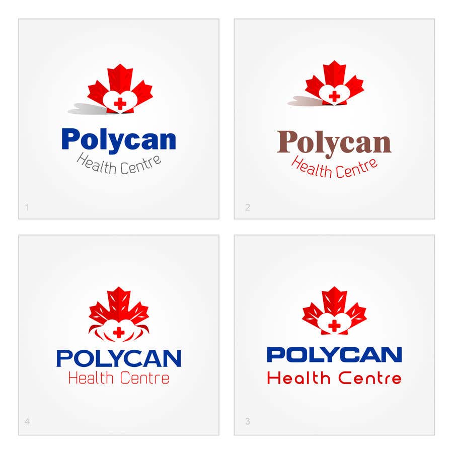
Canadian Care
Usually, I hunt upon keywords in the brief of the client to start the process of generating ideas. You mentioned that the center is operated by doctors with Canadian qualifications. So, I wanted to boast/boost this concept; hence, here's my prototype made in four versions that show slight variations in coloring or type-face. Trust, confidence, reliability, and shining health is what I'm trying to convey in this logo. Hopping I've achieved this goal. ************ This Entry here includes about 12 slides. Regarding colors, many researches and articles on the net agrees that blue and it's shades is the number one choice for healthcare-related designs. I tried, while designing, to test many many colors and I believe this is the best trustworthy reliable design. You can flip them to all. Hope you like the concept. Less


