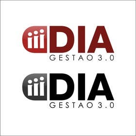
Logo Design DIA
- Estado: Closed
- Premio: $165
- Propuestas recibidas: 9
- Ganador: eyedezign
Resumen del concurso
DIA is a business management consulting business. The DIA brand has to come with the slogan GESTAO 3.0. We need an icon at the mark that denotes human growth. The brand should convey confidence, credibility, seriousness. The colors are preferred lead, black, burgundy and white.
Habilidades recomendadas
Tablero de aclaración pública
-
MonstroGigante
- 11 años atrás
Boa noite Fábio, observamos que vc ainda nao fez escolha sobre o logotipo no seu concurso. Espero que seja dúvida para escolher o melhor entre muitos bons! Casa seja dúvida por insatisfação, podemos conversar e reavaliar sua identidade visual ou fazer qualquer alteração necessária em nosso design. Abraço de Monstro!
- 11 años atrás
-
DigiMonkey
- 11 años atrás
Hi, can you rate all entries?
TY- 11 años atrás
-

DigiMonkey
- 11 años atrás
Hi, pelase check #148
Thank you.- 11 años atrás
-

dirak696
- 11 años atrás
hi please check #146 very thanks
- 11 años atrás
-

eyedezign
- 11 años atrás
Hi Please check my private message . Thanks :)
- 11 años atrás
-

salunkeswagat
- 11 años atrás
please check #112 & #113 ...
tried for some new Concept- 11 años atrás
-

salunkeswagat
- 11 años atrás
Please check #105
- 11 años atrás
-

yeaho00
- 11 años atrás
#97 Please Check
- 11 años atrás
-

MaxDesigner
- 11 años atrás
Dear CH : Please, increase the Prize money. Regards.
- 11 años atrás
-

stanbaker
- 11 años atrás
Please review my submissions numbers 88, 89, 90 and 91. Thank you.
- 11 años atrás
-

bigredbox
- 11 años atrás
plz chk #87! thks
- 11 años atrás
-

Organizador del concurso - 11 años atrás
IMPORTANT ANNOUNCEMENT
Dear designers;
The logos that joined the two words (or BI+DIA or DIA+BI) left a very bad pronunciation in Portuguese. We had to fix that and make it more simple. The logo will be DIA, with slogan "Gestão 3.0". We need an icon.
I apologize for the work already done, but we also did not anticipate this. Please adjust their designs to the new script. Thank you.
Fabio.- 11 años atrás
-

ss2277
- 11 años atrás
please have a look at recognizable logo #81
thanks- 11 años atrás
-

5zones
- 11 años atrás
Hi CH, Please Check #79 and Feedback Please. Thnks...
- 11 años atrás
-

5zones
- 11 años atrás
Hi CH, Please Check #78 and Feedback Please. Thnks...
- 11 años atrás
-

5zones
- 11 años atrás
Hi CH, Please Check #78 and Feedback Please. Thnks...
- 11 años atrás
-

stanbaker
- 11 años atrás
Please review my submission number 76. Thank you.
- 11 años atrás
-

stanbaker
- 11 años atrás
Please review my submission number 31. Thank you.
- 11 años atrás
-

Organizador del concurso - 11 años atrás
We DO NOT WANT to mark denotes "school", "student" or "certified".
You can use the leaden gray, black, white and burgundy.
Write "B.I." . Do not write "BI".
We need the "B.I." is pronounced separately from the "DAY". For that reason They put the icon in the middle. If you have another suggestion to separate the pronunciation occurs, please let us see. Please send us your proposal. Thank you.- 11 años atrás
-

BabyIsh37
- 11 años atrás
and also on #7 , #8 . Thanks !
- 11 años atrás
-

BabyIsh37
- 11 años atrás
Sir please have a look on #5 , #6 and please give a feed back . Thank you !
- 11 años atrás
-

Organizador del concurso - 11 años atrás
The icon should you format seed opening. But you must also remember elements of human growth. But can not be complex, congested.
- 11 años atrás
-

Mellorke
- 11 años atrás
Were you able to see the logo clearly on your end? It is very distorted on my end. As regards the icon, it is meant to resemble a human with outstretched leaves as arms. What sort of seed would you like to have incorporated? Would you like for it to resemble a bean, or something rounder?
- 11 años atrás
-

Organizador del concurso - 11 años atrás
I see your design too warped. I have no preference for one type of seed espeífica.
- 11 años atrás
-

Organizador del concurso - 11 años atrás
br
- 11 años atrás
-

Organizador del concurso - 11 años atrás
org.
- 11 años atrás
-

Organizador del concurso - 11 años atrás
diagrama.
- 11 años atrás
-

Organizador del concurso - 11 años atrás
@
- 11 años atrás
-

Organizador del concurso - 11 años atrás
fabiofurtado
- 11 años atrás
-

Mellorke
- 11 años atrás
The concept I uploaded is in PNG format because the website isn't allowing me to upload AI or EPS formats.
- 11 años atrás
-

Mellorke
- 11 años atrás
My logo concept hasn't uploaded properly and looks awful! Please send me a message so that I can resend it : ) Regards, K Mellors
- 11 años atrás
Cómo comenzar con los concursos
-

Publica tu concurso Fácil y rápido
-

Consigue toneladas de propuestas De todo el mundo
-

Elige la mejor propuesta ¡Descarga fácilmente los archivos!

