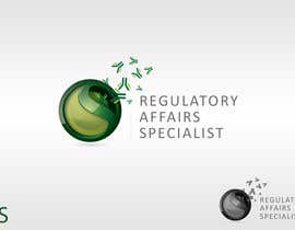
Logo Design for Regulatory Affair Specialist
- Estado: Closed
- Premio: $290
- Propuestas recibidas: 56
- Ganador: mtuan0111

Resumen del concurso
I am going to apply for a job within the pharmaceutical industry. For my applications I need an elegant, professional logo for my personal branding e.g. for the application cover-letter letterhead that makes me shine out the other applicants.
Exact des
Habilidades recomendadas
Comentarios del empleador
“Thank you so much for your design! I was really impressed of the design! Was best out of all, several designs were very useful from him. I could have chosen all of them to win! I hired mtuan0111 again.”
![]() sophie2907, Austria.
sophie2907, Austria.
Tablero de aclaración pública
-

DianaMJ
- 11 años atrás
Oh, it looks like my webpage was not refreshed, so that my post came after the announcement...
Congratulation for the winner,- 11 años atrás
-
DianaMJ
- 11 años atrás
HI, I enhanced earlier design, Plz check #106
- 11 años atrás
-

Organizador del concurso - 11 años atrás
THANK YOU FOR ALL LOVELY DESIGNS! YOU ALL DID AN AMAZING JOB AND I WAS VERY MUCH IMPRESSED HOW DIFFERENT DESIGNS CAME UP!
IN THE END I REALLY FALL IN LOVE WITH DESIGN #103 !
CONGRATULATIONS TO MTUAN0111 :)!! *AWESOME*- 11 años atrás
-
Organizador del concurso - 11 años atrás
Who will become #100 ?
- 11 años atrás
-
Organizador del concurso - 11 años atrás
Thank you so much for all ideas! You are all great!
- 11 años atrás
-

MeluCatalin
- 11 años atrás
Hi !
Please check #99 ... waiting for feedback. Thanks !- 11 años atrás
-
Organizador del concurso - 11 años atrás
Hey MeluCatalin, thank you for your design. I like the dark green part, but I don't like the font too much and the building blocks of the initials
- 11 años atrás
-
GlenTimms
- 11 años atrás
Hi,
Thank you for the ratings for #50 and #58 . I have submitted another, #80 . Please let me know if there is anything I can do to improve any of my designs for you.
Regards,
Glen.- 11 años atrás
-
Organizador del concurso - 11 años atrás
Thank you Glen for some more submissions. I think that one looks very professional already. Just feel it is a bit wide in shape. Especially the Y looks so extremely bold.
- 11 años atrás
-

Warrior8101
- 11 años atrás
Thanks.
I removed shadow on font #75- 11 años atrás
-
Organizador del concurso - 11 años atrás
Much more professional already :).
- 11 años atrás
-
Organizador del concurso - 11 años atrás
#77 : nice but too much colorflow.
- 11 años atrás
-
Warrior8101
- 11 años atrás
How do you feel with #68 sir?.
I should offer other designs.
Thanks.- 11 años atrás
-
Organizador del concurso - 11 años atrás
Hi Warrior8101! thank you for your submission. I like it, though I don't like the shadow of the font. I feel it is still too much going on in your logo. I would love to see other designs :). Thank you!
- 11 años atrás
-

urdesign
- 11 años atrás
Hi CH,, please check #57 .. its professionally simple... waiting for feedback. thanks
- 11 años atrás
-
Organizador del concurso - 11 años atrás
Thank you urdesign for your submission. I like the font, but the combination of colors is probably a little bit too much "leisure time" than really for professional. Maybe you can improve this a bit?
- 11 años atrás
-
urdesign
- 11 años atrás
how bout #69 ... thanks for the feedback..
- 11 años atrás
-
Warrior8101
- 11 años atrás
Hi..
Plz have a look #68 .
Thanks.- 11 años atrás
-
Organizador del concurso - 11 años atrás
Many great designs! Thank you so much for all submissions so far!
To help you understand what I am looking for I put my current three favorites at 5-stars :)!- 11 años atrás
-
Organizador del concurso - 11 años atrás
Clean sophisticated font, nice well thought through design, ideally a bit out of the box. I know it is not easy but you are doing all a great job *impressed*
- 11 años atrás
-

Jevangood
- 11 años atrás
Please rate and give feedback for #35.
- 11 años atrás
-
Organizador del concurso - 11 años atrás
Classy as usual Mr. Jevangood.
- 11 años atrás
-

badcom
- 11 años atrás
I also added #29 let me know what you think.
- 11 años atrás
-
Organizador del concurso - 11 años atrás
Thank you badcom for your submission. I don't like the font that much, reminds me on WordArt. Also the Logo part looks a bit noisy with the light yellow lines over the CS.
- 11 años atrás
-

IjlalB
- 11 años atrás
Hi sophie,
Please leave a feedback for #33
Thanks- 11 años atrás
-
Organizador del concurso - 11 años atrás
Very nice design IjlaIB... but something I feel is still missing. Just don't know what :)
- 11 años atrás
-

SteveReinhart
- 11 años atrás
21 will get you the job!
- 11 años atrás
-
Organizador del concurso - 11 años atrás
Thank you for your submission Steve. Looks classy, but I am not so sure about those white "overlaps" around the middle cross.
- 11 años atrás
-
gokul1487
- 11 años atrás
Hi Sophie please have a check on #11 . Looking forward to your feedback.
- 11 años atrás
Ver 2 mensajes más
-
gokul1487
- 11 años atrás
Well , the idea behind using the leaf shape was to indicate an extending hand of help, the antibody structure in the center and your initials on either side of it. The whole combination would be you extending help to the ones in need through the company you are going to join. :)
- 11 años atrás
-
Organizador del concurso - 11 años atrás
Nice idea gokul1487. I like the idea with the hands/leafs, however I could not see it that much, that is why I asked. Maybe you have any chance to bring that more through? Thank you
- 11 años atrás
-

mtuan0111
- 11 años atrás
#16 . Thanks .. ;)
- 11 años atrás
-
Organizador del concurso - 11 años atrás
Different to the other of your designs, but definitively something I need to think about :). Nice because it reminds me on the people and contacts that are behind my work :)
- 11 años atrás
-

focused
- 11 años atrás
Please 'seal' contest. Thanks.
- 11 años atrás
-
Organizador del concurso - 11 años atrás
Hi, I am sorry but I promised to keep the contest public all the way.
- 11 años atrás
-
badcom
- 11 años atrás
Any thoughts on #6 it's just a rough for ideas
- 11 años atrás
-
badcom
- 11 años atrás
I will work on it, thank you for your feedback...
- 11 años atrás
-
Organizador del concurso - 11 años atrás
Thank you too :)
- 11 años atrás
-
Jevangood
- 11 años atrás
Please rate and give feedback on #8 and #9. I feel the graphic I added gives a more professional tone and also shows some style. I thought a graphic wouldn't work at all, but I think it does.
- 11 años atrás
-
Jevangood
- 11 años atrás
Is there anything I can do to make it better? Anything you would prefer to see changed?
- 11 años atrás
-
Organizador del concurso - 11 años atrás
I think it is a very nice logo already. I think you can't make it much better anymore as it is right now, but I need to wait for the other suggestions. Thank you Jevangood for your input, I will vote in a few days my favorite!
- 11 años atrás
-
Organizador del concurso - 11 años atrás
#7 : very nice idea! How would the logo look on a white background?
- 11 años atrás
-
Jevangood
- 11 años atrás
Please rate and give feedback for #3 .
I figured I'd stay away from the logo with medication in it. After all, your going for professionalism. Many people that I've seen work with me usually try to keep it clean. No offense at all.- 11 años atrás
-
Organizador del concurso - 11 años atrás
Looks very nice! Now this could be even printed!
- 11 años atrás
-
Jevangood
- 11 años atrás
Thanks. I'm going to submit another one very similar but I'm gonna add a graphic to it.
- 11 años atrás
-
Organizador del concurso - 11 años atrás
Even black background looks nice, it would be good to have a white background and possible some graphic included as well
- 11 años atrás
-

Zedworks Studios
- 11 años atrás
Could you seal the contest Sophie?
- 11 años atrás
-
Organizador del concurso - 11 años atrás
Hi zedworks, I decided to keep it public, and not seal the contest
- 11 años atrás
-
Jevangood
- 11 años atrás
Just wondering if the contest is going to be sealed or not. Cause I have a logo ready and I don't mind posting it if its going to stay public, but if its going to be sealed I would like to wait to post it, until it gets sealed that is.
- 11 años atrás
-
Organizador del concurso - 11 años atrás
It is NOT sealed and stays public all the way.
- 11 años atrás
Cómo comenzar con los concursos
-

Publica tu concurso Fácil y rápido
-

Consigue toneladas de propuestas De todo el mundo
-

Elige la mejor propuesta ¡Descarga fácilmente los archivos!