New Logo / Brand Design
- Estado: Closed
- Premio: $150
- Propuestas recibidas: 2
- Ganador: Firoj807

Resumen del concurso
MarkIT Space is a savvy marketing and IT company. We would like a logo that reflects that image. We want to be perceived as pure professionals that can supply top-quality services.
Please get creative! We want a unique and original logo. We are completely open to new and different designs. We are happy with almost any colour(s) or even just black and white is fine too. We don't particularly like red though as it seems a bit too harsh a colour. As long as the logo still stands out on dark and light backgrounds as well as multi-coloured backgrounds.
We’re open to typeface suggestions but particularly like ‘space-like’ fonts.
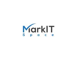
We would like to see the full name, "MarkIT Space" incorporated in the logo but being an IT company, in particular, we need the logo to be reproduced down to a tiny icon size and therefore the name of the company would likely get lost. Therefore, we would also like a smaller symbol, even just "MITS", so that our logo is suitable to be reproduced at any size - large or small. With regards to symbols, we do not like lots of tiny squares or the typical 'corporate swoosh' as they are so overdone already in existing logos. Perhaps the use of a star within the 'A's might work, but we'll leave the creativity for you to decide.
Please ensure the logo is appropriate and is suitable to represent the company. It should be simple, memorable and timeless. It must not be plagiarised and must not use stock art.
When presenting the logo, it would be good if you could demonstrate how it could look on different coloured backgrounds so we can see that it would work on a light and dark background and even include an example icon for when we need it to be tiny.
The chosen logo must be resizable (e.g. a vector graphic) so that it can be printed at any size without losing quality – large or small, e.g. printed onto large posters or used as tiny web icons. It also needs to be suitable for a variety of media, in addition to print and online, such as engraving, embroidery, etc. Also, on acceptance of the logo, it would be great if you could provide a simple style guide, if possible, on the best practices for using the logo so that we could use this as a starting point to a bigger branding makeover.
Habilidades recomendadas
Comentarios del empleador
“Excellent graphic design work. English spelling and grammar skills are not 100% but is still able to communicate effectively and correct any errors when notified.”
![]() MITSfreelancing, Australia.
MITSfreelancing, Australia.
Tablero de aclaración pública

Cómo comenzar con los concursos
-

Publica tu concurso Fácil y rápido
-

Consigue toneladas de propuestas De todo el mundo
-

Elige la mejor propuesta ¡Descarga fácilmente los archivos!